There is a very high possibility that you are reading this blog post on your phone or tablet right now. Maybe you are on your commute in or out of the office. Perhaps you are on your lunch break and found us by browsing. We sincerely hope you found us via your favorite search engine, thanks to the art and science of good SEO. Practicing good SEO means being aware of Google’s preference for mobile-friendly websites and designing your website to be responsive to the mobile user. Many large companies know this and practice this with their own sites. Do you know if your website is responsive for mobile devices?
THE BASICS: WHAT IS MOBILE-FRIENDLY AND RESPONSIVE DESIGN?
Web habits have changed significantly since the invention of the smartphone. It shouldn’t be a surprise to you that more users are browsing on their phone or other mobile device than they are on a desktop computer. In October of 2016, statcounter reported that internet usage via mobile and tablet devices exceeded desktop worldwide for the first time, and that number is growing. Furthermore, with users reporting that they often use more than one device to accomplish a task, often hopping from phone to desktop (and back again), it’s essential that your website functions to meet users where they are, and that’s everywhere!
MOBILE WEBSITES
Before Responsive Web Design became popular, the first solution for creating a great mobile experience was to design an entirely separate mobile website. The site would detect when a mobile device was being used and forward you to the mobile version of the site, usually providing an option to link back to the desktop version. The drawback was that there were two different versions of your site that had to be designed and updated. If you wanted to create a custom layout for tablets or other devices, that was one more version of your site that needed to be created.
RESPONSIVE WEBSITES
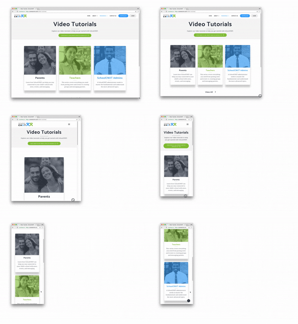
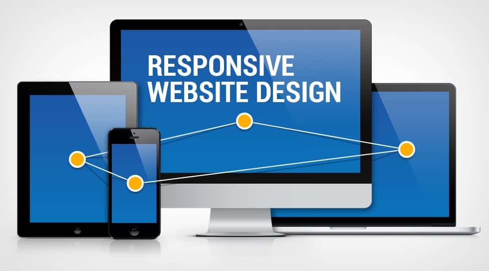
Responsive Web Design (RWD) overcame the drawbacks of creating a separate mobile website and became an effective solution to the previously mentioned multi-screen scenario. Rows, columns, and elements of one web page are assigned relative sizing values, such as percentages, rather than absolute values, like pixels or points. Media Queries can be used to tell certain elements to change based on what screen size or resolution someone is viewing the site on (e.g. changing all 3-column rows into 1-column when the browser width is below 768px). These features allow the layout to adapt to the size of a browser, so whatever device a visitor is using, they will have an optimal viewing experience.
DO I HAVE A MOBILE-FRIENDLY WEBSITE?
Whether you have a separate mobile version of your site or a fully responsive site, Google views them both as “Mobile-Friendly”, as long as they meet certain criteria. Start with the Mobile-Friendly Test to see if your website passes the test.
Google uses a robot to determine if your site is mobile-friendly, but even if you pass the test, that doesn’t mean the human actually using your site on their phone is having a good experience. If you have Google Webmaster Tools or Google Analytics set up, you can analyze data relating to how your visitors are finding and using your site. Are they coming through mobile devices? How long do they stay? What do they do when they visit? This data can help you determine potential issues with design, content, functionality, and page loading time, and lead you to try out new solutions to make a user’s mobile experience better.
DO I HAVE A RESPONSIVE WEBSITE?
With RWD being a more efficient way to create a great user experience across all platforms, most web developers employ this style of design. The easiest way to tell if your site is responsive is to go on your laptop or desktop computer, open up a browser, navigate to your site and drag the bottom right corner around to resize the browser. If you see the text, pictures and other content adjusting every step of the way, your site is responsive.
MAKING CHANGES OR OPTIMIZING WHAT YOU HAVE
If your website is responsive, great! You’re in good shape! Time to hone in on design, content, and SEO to ensure that you are being found, your content is being ranked highly by search engines, and your user is enjoying their experience on your site through intuitive, engaging design.
If you find that you don’t have a responsive website, you are probably overdue for a website refresh. There are a lot of resources to help with that! If you are running your own site and using WordPress, consider starting with a new theme. If you are working with a web developer, have a serious conversation about transitioning to a responsive design and aligning your website’s performance with your business goals.
There are plenty of ways for your potential customers and clients to find you on the web. More likely than not, they are finding you on their phones and other mobile devices. Being mobile-friendly isn’t quite enough. You need a website that is responsive to today’s user, and today’s user is bouncing between devices as they go throughout their day. Responsive web design provides a better experience for your visitors, allowing them to think less about the function of your site and more about what your business has to offer them.


